Hello, I blog!
I share all my sporadic and toilet thoughts in here, because I am random like that.
Prevent automated registrations with JS
After GameMaki (one of my current pet projects) was hit by an onslaught of spam, I spent the last couple of hours thinking about how to prevent automated registrations.
Originally, I attempted a very primitive method, which is to add a hidden field in the registration form which is set to ‘true’ when the form is loaded on a Javascript-enabled browser. When the form is submitted, this hidden field is checked for its value, and it only goes through when the value is ‘true’.
Obviously it hadn’t worked. It was too straightforward, and I’m pretty sure bots are much smarter than that.
So I thought, checking for whether the site was loaded in a standard browser wasn’t good enough. In order for a request to be human-initiated, there has to be some sort of interaction with the website – whether it is a click, scroll or focus.

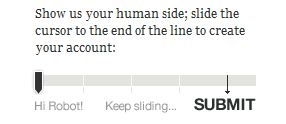
jQuery slider by TheyMakeApps for form submission.
TheyMakeApps has quite a cool implementation that requires some form of human interaction to successfully submit a form. Instead of a standard ‘click’ to the submit button, their implementation requires the user to drag a slider to an end-point. jQuery is used to detect the position of the slider and the form will submit only when the slider has reached a certain point in the bar.
Quite nifty, but it didn’t feel natural. People are used to hitting ‘tab’ when navigating from one form field to another, before a final ‘tab’ and an ‘enter’ to submit a form.
I didn’t want to yank users out of their comfort zone. So, how do I check for automated registrations without imposing any additional burden to the user? (And quite obviously, CAPTCHAs are out of the question.)
Here’s how I eventually did it. Well, it still involves a hidden field, for sure.
Place a hidden field in your form as follows. This field has a unique ID of ‘botcheck’ with a default value of ‘false’.
<input type="hidden" name="botcheck" id="botcheck" value="false" />
Now, what we need is a bit of Javascript and jQuery.
I have two functions in my Javascript file. The first function, randomString() generates a random string of numbers to populate the hidden field with. The second is the validation function which will be called when the form is submitted. On top of that, we have one global variable to track the value of the generated random string.
// Global variable

var randomstring = "";
// Function to generate a random string

function randomString() {

  var chars = "0123456789ABCDEFGHIJKLMNO

PQRSTUVWXTZabcdefghiklmnopqrstuvwxyz";

  var string_length = 8;

  for (var i=0; i<string_length; i++) {

    var rnum = Math.floor(Math.random() * chars.length);

    randomstring += chars.substring(rnum,rnum+1);

  }

}
// Function to verify hidden field value

function doBotCheck() {

  var botcheckfield = $('#botcheck').val();

  if (botcheckfield == randomstring) {

    return true;

  } else {

    alert("Hello, robot!");

    return false;

  }

}
Note: Credit for the randomString() function goes to MediaCollege.
Now that we have all our Javascript functions ready, let’s add a bit of jQuery magic.
On document load, a random string will be generated. A ‘focus’ event is bound to all my form’s input fields. When this event is triggered, the hidden field is populated with the random string.
I chose the ‘focus’ event as it requires manual user interaction with the form to verify that the user of the form is indeed a human. (Originally, I contemplated using the ‘change’ event but decided against it since the fields can be directly manipulated via a script anyway.)
The use of a random string ensures that the value of the hidden field will not be easy to guess if the spammer wanted to directly manipulate it.
So, we have this.
//Populate hidden field only when user triggers a manual interaction with the form

$(document).ready(function() {

  // Generate a random string

  randomString();
   // Update hidden field on field focus

  $('#MyForm input').live('focus', function() {

    $('#botcheck').val(randomstring);

  });

});
Last but not least, remember to call the validation function from your form on submit.
<form id="MyForm" onSubmit="return doBotCheck()" method="POST">
And wa-laaaaah.
Well, this is my method for now. Whether it works, I’ll just have to wait and see. If you see any flaws in my method, don’t hesitate to holler. And if you’ve better ideas on how to solve this problem, feel free to share ’em!
Brendalogy, rebranded
Hullo. No, your eyes aren’t tricking you. This place has been refurbished. At long last.
The previous layout, aesthetically-pleasing as it was, no longer fitted me. The coding was all over the place and the CSS, long and draggy. Plus, it was severely lacking from a usability point of view.
Since the last redesign, my style has done a 360-degree turn to clean and minimalist … albeit still with a slight touch of the funkiness inherent in my personality. My knowledge of CSS and web usability has also matured greatly in the past one year plus thanks to my experience doing front-end development in two start-ups. It’s about time I applied all that to my own site.
I’m really pleased with the result. It’s been tested in Firefox, Chrome and IE 9. IE 8 users – my apologies – you’re gonna be seeing ugly rectangles all over the place because is the border-radius CSS attribute is not supported. (And why are you even using IE anyway?!)
That said, I’d like to introduce my own logo. You’ve probably already seen it from the main site or from the favicon. I’ve always wanted a symbol which I would be recognized with, but haven’t had the time to sit down and craft one. I finally did, yesterday afternoon.
I wanted something clean and simple. Preferably in black and white so it’d be much easier to work with and easily integrable in any design. Right from the beginning, I knew I wanted a circular logo. So at least I had a baseline to start with (instead of wasting time playing with shapes).
The choice of font was the tricky part. My original choice was Georgia. It’s easily one of my favourite fonts. Simple and stylish. And extremely readable.
The first version of my logo was entirely in Georgia.

‘BT’ Brendalogy logo, version 1.
It remained up for a grand total of fifteen minutes. The more I stared at it, the more I found it boring. And dull. It’s a far cry from reflecting who I really was. Additionally, someone pointed out on Twitter that it slightly resembled WordPress’s logo, echoing my own initial impressions.
So it was back to the drawing board, playing with fonts. I needed something funky.
I played with cursive/script fonts for over five minutes and decided that such fonts for initials was far from ideal. This is due to the lack of context. With a proper, full word – one can still roughly decipher uncertain letters based on the combination of other letters surrounding it. People read words as a whole anyway, and not letter-by-letter.
With just two letters for my initials however, it’s an entirely different story. I ended up with a mess of squiggles.
I eventually settled on Cooper. (And during the process of experimenting with more readable fonts, I realized I seem to have a strange affinity with fat fonts.)
And voila. Here’s the final logo.

‘BT’ Brendalogy logo, final version.
As always, with any new layout, there might still be bugs floating around. Do holler if you see anything strange or out of the ordinary because chances are, it wasn’t supposed to be there. Thanks!