Hello, I blog!
I share all my sporadic and toilet thoughts in here, because I am random like that.
Brendalogy, rebranded
Hullo. No, your eyes aren’t tricking you. This place has been refurbished. At long last.
The previous layout, aesthetically-pleasing as it was, no longer fitted me. The coding was all over the place and the CSS, long and draggy. Plus, it was severely lacking from a usability point of view.
Since the last redesign, my style has done a 360-degree turn to clean and minimalist … albeit still with a slight touch of the funkiness inherent in my personality. My knowledge of CSS and web usability has also matured greatly in the past one year plus thanks to my experience doing front-end development in two start-ups. It’s about time I applied all that to my own site.
I’m really pleased with the result. It’s been tested in Firefox, Chrome and IE 9. IE 8 users – my apologies – you’re gonna be seeing ugly rectangles all over the place because is the border-radius CSS attribute is not supported. (And why are you even using IE anyway?!)
That said, I’d like to introduce my own logo. You’ve probably already seen it from the main site or from the favicon. I’ve always wanted a symbol which I would be recognized with, but haven’t had the time to sit down and craft one. I finally did, yesterday afternoon.
I wanted something clean and simple. Preferably in black and white so it’d be much easier to work with and easily integrable in any design. Right from the beginning, I knew I wanted a circular logo. So at least I had a baseline to start with (instead of wasting time playing with shapes).
The choice of font was the tricky part. My original choice was Georgia. It’s easily one of my favourite fonts. Simple and stylish. And extremely readable.
The first version of my logo was entirely in Georgia.

‘BT’ Brendalogy logo, version 1.
It remained up for a grand total of fifteen minutes. The more I stared at it, the more I found it boring. And dull. It’s a far cry from reflecting who I really was. Additionally, someone pointed out on Twitter that it slightly resembled WordPress’s logo, echoing my own initial impressions.
So it was back to the drawing board, playing with fonts. I needed something funky.
I played with cursive/script fonts for over five minutes and decided that such fonts for initials was far from ideal. This is due to the lack of context. With a proper, full word – one can still roughly decipher uncertain letters based on the combination of other letters surrounding it. People read words as a whole anyway, and not letter-by-letter.
With just two letters for my initials however, it’s an entirely different story. I ended up with a mess of squiggles.
I eventually settled on Cooper. (And during the process of experimenting with more readable fonts, I realized I seem to have a strange affinity with fat fonts.)
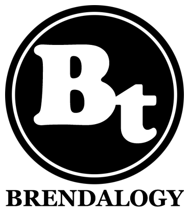
And voila. Here’s the final logo.

‘BT’ Brendalogy logo, final version.
As always, with any new layout, there might still be bugs floating around. Do holler if you see anything strange or out of the ordinary because chances are, it wasn’t supposed to be there. Thanks!