
Hello, I blog!
I share all my sporadic and toilet thoughts in here, because I am random like that.
Finally, another fresh look.
I wish I’ve done this earlier – removing the clutter from the previous interface and just leaving it clean and simple so that I’ll be inspired to actually write.
At last, I did.
Finally, my torrent of updates from my San Francisco trip earlier this month can begin. I’ll be posting random pictures, quips and adventures from my two and a half week trip over the next couple of weeks in no particular order. Stay tuned.
Meanwhile, happy hunting for the little ‘easter eggs’ (random doodles with my mouse) I’ve scattered around the site. Here’s your first hint – the navigation.
What’s in a brand? It’s beyond just a name.
The following snippet from a random conversation got me thinking.
“That’s a nice watch. Where did you get that watch from?”
“It’s from Swatch,” says I.
“Really? Are you sure? I don’t see the word ‘Swatch’ anywhere leh!”
Swatch is a brand that’s pretty well known for their pop, funky watch designs. In fact, I personally believe they are one of the few watch brands with a clear identity. They’ve established their branding so well that any watches they create are distinctively Swatch.
Such is the beauty of good branding where brands are recognized by the identity they create or the personality they exude.
Unfortunately, it still seems that people still recognize the value of a possession primarily by the presence of a brand name on it, which is pretty sad. The unsung heroes behind a company with a good branding (usually the designers and branding managers) are not given the recognition they deserve.
This may not be representative of the general population but based on my own experience in a predominantly Asian country and surrounded by materialistic people. A Coach bag is not a Coach bag unless it has the Coach logo on it. A Louis Vuitton Bag is not a Louis Vuitton bag unless it’s emblazoned all over with the LV logo. “Don’t buy that bag, it doesn’t have the Coach logo on it. No one will know it’s a Coach bag!”
I’ve encountered the above conversation snippet more often than I can count on both hands and I can’t help but feel indignant for the designers behind the brands involved.
I understand people love to associate themselves with brands as it feels prestigious. I’ve no argument against that. We’re a status-obsessed society anyway.
But surely, there’s a better way to associate oneself with a brand other than having a fixation on the actual presence of the brand name or logo on one’s physical possessions.
At the most simple level, how about an appreciation for the design instead? Does it suit your needs? Is it nice?
What kind of personality does the brand exude? (An executive feel? A youthful, funky feel? A contemporary feel with an emphasis on simplicity?) Does the it reflect you? Some people love to associate themselves with brands that are in-line with their beliefs (i.e. philanthropy or a brand’s viewpoint and action towards issues such as ‘against animal testing’) or whose designs represent who they are.
That’s so much better than being fixated on a mere logo or name.
My name is Brenda. But, must I walk around with my name plastered on my chest for my friends to know it’s me? True proponents of a brand see beyond a name.
Just like how individuals are recognized based on a whole bunch of other characteristics such as behaviour, personality, ability, family background and looks by the people they matter to most.
Not the name on their identity card.
Brendalogy, rebranded
Hullo. No, your eyes aren’t tricking you. This place has been refurbished. At long last.
The previous layout, aesthetically-pleasing as it was, no longer fitted me. The coding was all over the place and the CSS, long and draggy. Plus, it was severely lacking from a usability point of view.
Since the last redesign, my style has done a 360-degree turn to clean and minimalist … albeit still with a slight touch of the funkiness inherent in my personality. My knowledge of CSS and web usability has also matured greatly in the past one year plus thanks to my experience doing front-end development in two start-ups. It’s about time I applied all that to my own site.
I’m really pleased with the result. It’s been tested in Firefox, Chrome and IE 9. IE 8 users – my apologies – you’re gonna be seeing ugly rectangles all over the place because is the border-radius CSS attribute is not supported. (And why are you even using IE anyway?!)
That said, I’d like to introduce my own logo. You’ve probably already seen it from the main site or from the favicon. I’ve always wanted a symbol which I would be recognized with, but haven’t had the time to sit down and craft one. I finally did, yesterday afternoon.
I wanted something clean and simple. Preferably in black and white so it’d be much easier to work with and easily integrable in any design. Right from the beginning, I knew I wanted a circular logo. So at least I had a baseline to start with (instead of wasting time playing with shapes).
The choice of font was the tricky part. My original choice was Georgia. It’s easily one of my favourite fonts. Simple and stylish. And extremely readable.
The first version of my logo was entirely in Georgia.
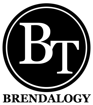
‘BT’ Brendalogy logo, version 1.
It remained up for a grand total of fifteen minutes. The more I stared at it, the more I found it boring. And dull. It’s a far cry from reflecting who I really was. Additionally, someone pointed out on Twitter that it slightly resembled WordPress’s logo, echoing my own initial impressions.
So it was back to the drawing board, playing with fonts. I needed something funky.
I played with cursive/script fonts for over five minutes and decided that such fonts for initials was far from ideal. This is due to the lack of context. With a proper, full word – one can still roughly decipher uncertain letters based on the combination of other letters surrounding it. People read words as a whole anyway, and not letter-by-letter.
With just two letters for my initials however, it’s an entirely different story. I ended up with a mess of squiggles.
I eventually settled on Cooper. (And during the process of experimenting with more readable fonts, I realized I seem to have a strange affinity with fat fonts.)
And voila. Here’s the final logo.
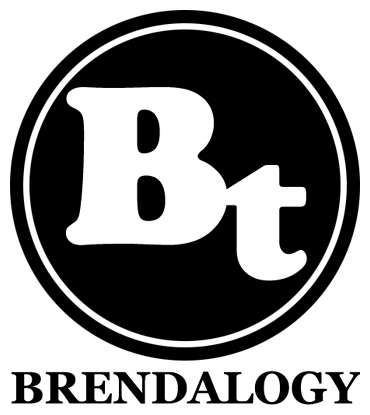
‘BT’ Brendalogy logo, final version.
As always, with any new layout, there might still be bugs floating around. Do holler if you see anything strange or out of the ordinary because chances are, it wasn’t supposed to be there. Thanks!