Hello, I blog!
I share all my sporadic and toilet thoughts in here, because I am random like that.
How Courts lost a customer to IKEA
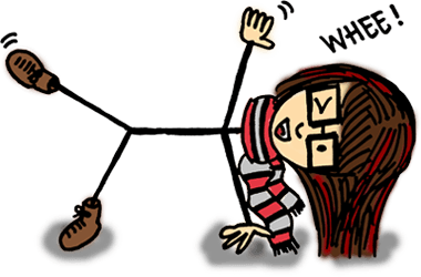
I walked into Courts yesterday to purchase a clothes rack. Courts is a large furniture and electronics outfit in Singapore, with branches around the island and a megastore in Tampines.
The wonders of being connected meant that I could look up their online catalog the night before to pick out what I wanted and verify stocks (to the point of even knowing that certain colours were already out of stock and will be restocked in February/March 2013). All I needed to do was to step into the store, look for the item, purchase it and out I go. Sounds simple enough.
It was a three-storey megastore, so I decided to ask the staff for directions. The staff on the second floor directed me to the ground floor “because that’s where all the accessories are”. Sounds fair, so I proceeded to the ground floor. After walking around in circles, I realized I was going nowhere and needed help again.
So I approached a boy in a black ‘Courts’ tee and relayed my question to him. After giving me a blank stare for several seconds, he admitted that he was “just a promoter” and that I had to approach a staff member in a blue tee. Those blue tees were pretty elusive to find, though. I nearly walked up to an ordinary shopper in a blue tee but common sense soon took over (he was carrying a shopping bag) to prevent potential embarrassment.
Circled the place again for nearly 5 minutes before I finally found two blue shirted staff members who were happily chatting with one another. I proceeded with my inquiry. One of them glanced at my phone (screenshot of the product), looked at me and went “no more!”
“No more?” I asked. “Seriously? Because I checked your website and it stated there is stock!”
“If you want, you go outside there and see!” He gesticulated wildly to the area outside the checkout counters. “If it’s not there then it’s sold out. No more!”
He immediately went back to chatting with his friend, totally oblivious to me gaping at him, my mouth wide open in disbelief.
This is what happens you hire staff (or salespeople) who don’t care about your business. The typical staff member will simply show up to do the bare minimum, leave on time and take their monthly paycheck. On the other hand, the engaged, dedicated staff member who believes that he plays a crucial role in the success of the company would do more.
In this case, a dedicated staff member will be able to recognize this interaction as an opportunity to retain a potential customer. He would have known that the product will be restocked in a couple of months. He would also be aware that I could have placed an advance order online and request for a self-collection at any outlet near my home. All this is not rocket science – I knew it simply by browsing their website. This information will have been relayed to me as alternatives, and the he’ll provide any necessary assistance.
This staff member on the other hand, seemed to be more interested in his bantering.
After finally confirming that the item was out of stock – seeing an empty rack with the item label – I decided to ‘test’ another staff member on their service knowledge in the hope that the guy spoke to earlier was just an anomaly. No dice either.
By then, I was completely annoyed with the lack of staff knowledge that I just decided to give up on the product altogether. Sure, it was lighter and more compact. Sure, the product was cheaper as well. But it’s no longer about the product. IKEA was just next door, and they retail products that are of equally good quality. And I haven’t had a bad experience with them yet.
So, I headed over.
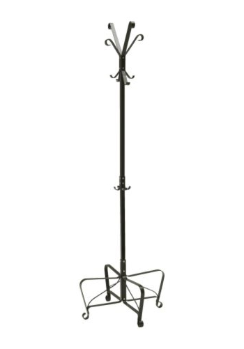
The PORTIS hat and coat stand.
Now, I have myself an awesome new rack at home from IKEA. While Courts lost a customer for life.
In today’s age, the average consumer is presented with a wide range of equivalent options for a singular product, that they’ve become indifferent. Companies can no longer afford to compete based on products alone because there is a low barrier to entry for consumers to simply do a brand switcharoo anytime they want. The products are all the same anyway. It’s the experience you provide that makes you stand out.
What makes the consumer sit up and take notice is not the “average” shopping experience, but something out of the ordinary. When faced with an extraordinarily bad service, the consumer will take to bitching online (which is what I’m doing now) or spread the negative message through word of mouth. In the consumer’s mind, your company will be tied to that bad experience forever.
Conversely, when the experience is surprisingly great, word spreads equally fast. In a world where consumers are generally used to receiving bad service, it’s extremely refreshing. Even inspiring. As for me – I’d most probably be waxing lyrical about the company to anyone I meet. And yes, I will definitely return.
It is the positively memorable experiences you provide that make your customers stick to you.
It’s high time companies realized that. Especially consumer-facing ones.
What’s in a brand? It’s beyond just a name.
The following snippet from a random conversation got me thinking.
“That’s a nice watch. Where did you get that watch from?”
“It’s from Swatch,” says I.
“Really? Are you sure? I don’t see the word ‘Swatch’ anywhere leh!”
Swatch is a brand that’s pretty well known for their pop, funky watch designs. In fact, I personally believe they are one of the few watch brands with a clear identity. They’ve established their branding so well that any watches they create are distinctively Swatch.
Such is the beauty of good branding where brands are recognized by the identity they create or the personality they exude.
Unfortunately, it still seems that people still recognize the value of a possession primarily by the presence of a brand name on it, which is pretty sad. The unsung heroes behind a company with a good branding (usually the designers and branding managers) are not given the recognition they deserve.
This may not be representative of the general population but based on my own experience in a predominantly Asian country and surrounded by materialistic people. A Coach bag is not a Coach bag unless it has the Coach logo on it. A Louis Vuitton Bag is not a Louis Vuitton bag unless it’s emblazoned all over with the LV logo. “Don’t buy that bag, it doesn’t have the Coach logo on it. No one will know it’s a Coach bag!”
I’ve encountered the above conversation snippet more often than I can count on both hands and I can’t help but feel indignant for the designers behind the brands involved.
I understand people love to associate themselves with brands as it feels prestigious. I’ve no argument against that. We’re a status-obsessed society anyway.
But surely, there’s a better way to associate oneself with a brand other than having a fixation on the actual presence of the brand name or logo on one’s physical possessions.
At the most simple level, how about an appreciation for the design instead? Does it suit your needs? Is it nice?
What kind of personality does the brand exude? (An executive feel? A youthful, funky feel? A contemporary feel with an emphasis on simplicity?) Does the it reflect you? Some people love to associate themselves with brands that are in-line with their beliefs (i.e. philanthropy or a brand’s viewpoint and action towards issues such as ‘against animal testing’) or whose designs represent who they are.
That’s so much better than being fixated on a mere logo or name.
My name is Brenda. But, must I walk around with my name plastered on my chest for my friends to know it’s me? True proponents of a brand see beyond a name.
Just like how individuals are recognized based on a whole bunch of other characteristics such as behaviour, personality, ability, family background and looks by the people they matter to most.
Not the name on their identity card.
Brendalogy, rebranded
Hullo. No, your eyes aren’t tricking you. This place has been refurbished. At long last.
The previous layout, aesthetically-pleasing as it was, no longer fitted me. The coding was all over the place and the CSS, long and draggy. Plus, it was severely lacking from a usability point of view.
Since the last redesign, my style has done a 360-degree turn to clean and minimalist … albeit still with a slight touch of the funkiness inherent in my personality. My knowledge of CSS and web usability has also matured greatly in the past one year plus thanks to my experience doing front-end development in two start-ups. It’s about time I applied all that to my own site.
I’m really pleased with the result. It’s been tested in Firefox, Chrome and IE 9. IE 8 users – my apologies – you’re gonna be seeing ugly rectangles all over the place because is the border-radius CSS attribute is not supported. (And why are you even using IE anyway?!)
That said, I’d like to introduce my own logo. You’ve probably already seen it from the main site or from the favicon. I’ve always wanted a symbol which I would be recognized with, but haven’t had the time to sit down and craft one. I finally did, yesterday afternoon.
I wanted something clean and simple. Preferably in black and white so it’d be much easier to work with and easily integrable in any design. Right from the beginning, I knew I wanted a circular logo. So at least I had a baseline to start with (instead of wasting time playing with shapes).
The choice of font was the tricky part. My original choice was Georgia. It’s easily one of my favourite fonts. Simple and stylish. And extremely readable.
The first version of my logo was entirely in Georgia.
‘BT’ Brendalogy logo, version 1.
It remained up for a grand total of fifteen minutes. The more I stared at it, the more I found it boring. And dull. It’s a far cry from reflecting who I really was. Additionally, someone pointed out on Twitter that it slightly resembled WordPress’s logo, echoing my own initial impressions.
So it was back to the drawing board, playing with fonts. I needed something funky.
I played with cursive/script fonts for over five minutes and decided that such fonts for initials was far from ideal. This is due to the lack of context. With a proper, full word – one can still roughly decipher uncertain letters based on the combination of other letters surrounding it. People read words as a whole anyway, and not letter-by-letter.
With just two letters for my initials however, it’s an entirely different story. I ended up with a mess of squiggles.
I eventually settled on Cooper. (And during the process of experimenting with more readable fonts, I realized I seem to have a strange affinity with fat fonts.)
And voila. Here’s the final logo.
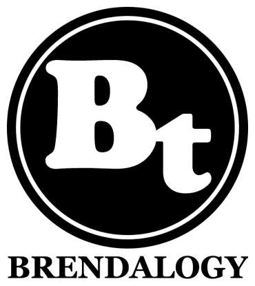
‘BT’ Brendalogy logo, final version.
As always, with any new layout, there might still be bugs floating around. Do holler if you see anything strange or out of the ordinary because chances are, it wasn’t supposed to be there. Thanks!